
Did you know that all
these elements…
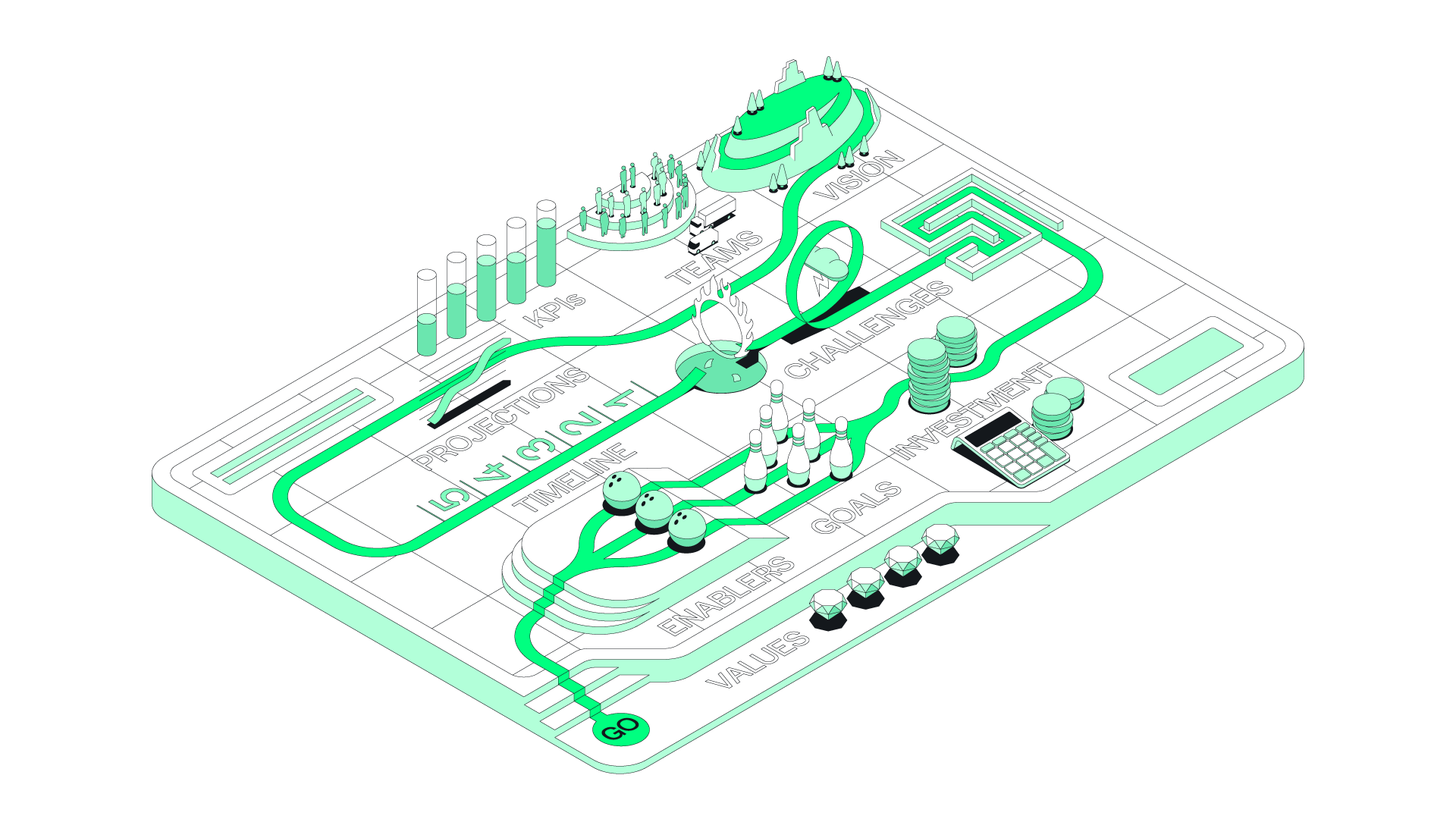
…can be
incorporated
into a strategy map?
Getting your people onboard with your strategy can be a challenge. Traditionally the approach has been slide after slide of bullet points, aka, ‘Death by Powerpoint’. When there’s so much to take in we humans struggle to grapple with it and, after a while, switch off: information overload.
Remember that last slideshow you sat through and how all those bullet points worked together to build a cohesive narrative? I didn’t think so.
That’s where strategy maps excel. Their visual nature creates immediate engagement and, by having all the key features visualised on a single page, gives audiences a broad understanding of what the strategy entails at a glance. More on Visualisation here…
VISUALISATION
That’s where strategy maps excel. Their visual nature creates immediate engagement and a broad understanding is conveyed through all the strategy’s key features appearing simultaneously in our field of vision.
When it comes to understanding any complex scenario, having this type of overview does a lot of the brain’s heavy lifting. This allows us to start joining the dots without having to rely on recall — something our brains struggle with even after very little complexity has arisen. Click here for more on the history and science of visualisation…
This freed-up cognitive capacity allows for better conversations and inspires more innovative, systemic thinking which, in turn, gives rise to deeper understanding and real progress toward adoption and behavioural change.
And therein lies the power of strategy maps.
GET IN TOUCH
EXPERIENCE
In my career to date I’ve created strategy maps and/or infographics for the following brands:
ABB
•
Aerospace Growth Partnership
•
Allianz
•
Argent
•
Baker Hughes
•
Barclays
•
Bayer
•
BP
•
Cancer Research UK
•
Castrol
•
Channel 4
•
Cisco
•
Clarks
•
Comcast
•
Coutts
•
Deustche Bank
•
DLG
•
ABB • Aerospace Growth Partnership • Allianz • Argent • Baker Hughes • Barclays • Bayer • BP • Cancer Research UK • Castrol • Channel 4 • Cisco • Clarks • Comcast • Coutts • Deustche Bank • DLG •
E.ON
•
First Great Western
•
GKN
•
Halifax
•
Heineken
•
HSBC
•
JLR
•
Kantar
•
Lloyds
•
Macmillan
•
Met Office
•
MINI
•
Natural England
•
Natwest
•
Northwell Health
•
RBS
•
RNLI
•
E.ON • First Great Western • GKN • Halifax • Heineken • HSBC • JLR • Kantar • Lloyds • Macmillan • Met Office • MINI • Natural England • Natwest • Northwell Health • RBS • RNLI •
Royal Mail
•
RSA
•
Standard Chartered
•
TAQA
•
UNFPA
•
University of Westminster
•
V.Group
•
Vodafone
•
World Animal Protection
•
World Health Organisation
•
Royal Mail • RSA • Standard Chartered • TAQA • UNFPA • University of Westminster • V.Group • Vodafone • World Animal Protection • World Health Organisation •
FAQs
-
Strategy maps should be seen for what they are; maps. They won’t contain the minutiae of every policy of your strategy. Far from it. They’re meant to give a holistic view of it — the ‘lay of the land’ as it were. A single image where all the elements can be seen and prominence given to the most salient. A distillation process is used to establish the most important points which can then be labelled and visually represented.
-
It depends on a few factors. Most obviously the complexity of the strategy but also things like illustration style and whether or not an interactive version or supporting documentation is required.
-
This depends on the same similar factors that dictate how long a map takes to create, namely complexity, illustration style and whether or not it needs to be interactive or requires any supporting documentation.
-
Yes! Get in touch to discuss.
-
Yep. This needs to be stipulated at the beginning of the project though as it affects how I approach it from the very start of the design process.
-
Scroll down to see my Process section below.
-
Strategy maps contain confidential information which makes them unsuitable for publication. Get in touch to find out more.
The dictionary definition makes the basic case for using visualisation. Read on for a more in-depth rationale…
2 MINUTE READ
The business case
By visually mapping a strategy onto a single page, all its key features appear in our field of vision simultaneously. This does a lot of the brain’s heavy lifting when it comes to understanding any complex scenario, giving us an overview of the entire strategy and allowing us to start joining the dots without having to rely on recall — something our brains struggle with even after very little complexity has arisen.
This freed-up cognitive capacity inspires more innovative, systemic thinking which, in turn, gives rise to real progress and change. And therein lies the power of visualisation for business.
[ GET IN TOUCH ]
process
How are strategy maps created?
It’s all about the process. In a nutshell, this is what it looks like:

1. Contact
The first call or meeting to discuss viability based on the broad parameters of the job, including scope, timeline, budget etc.
30–60 MINS

2. Immersion
A deep-dive session to analyse the brief in detail to gain a full understanding of the scope, goals and desired results, plus agree workflow, deliverables and timeline.
2–4 HOURS

3. Create
From initial creative concepts through to finished visual, this iterative process consists of design and review cycles until the work is finished. Timings differ significantly depending on complexity, illustration style, speed of feedback etc.
2–6 WEEKS

4. Launch
The timing of the launch is key to maximising the visual’s impact. If part of a wider campaign, consider how other events could distract from the visual’s rollout, and which could complement it.